Montana Healthy Communities Dashboard
Health, environment and adaptive capacity for every community in Montana
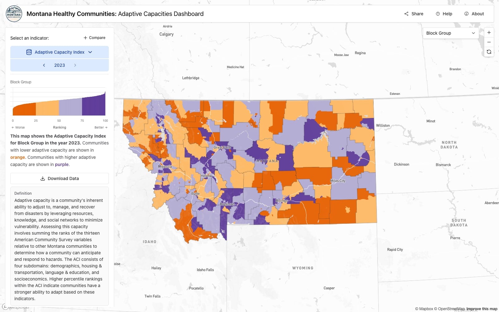
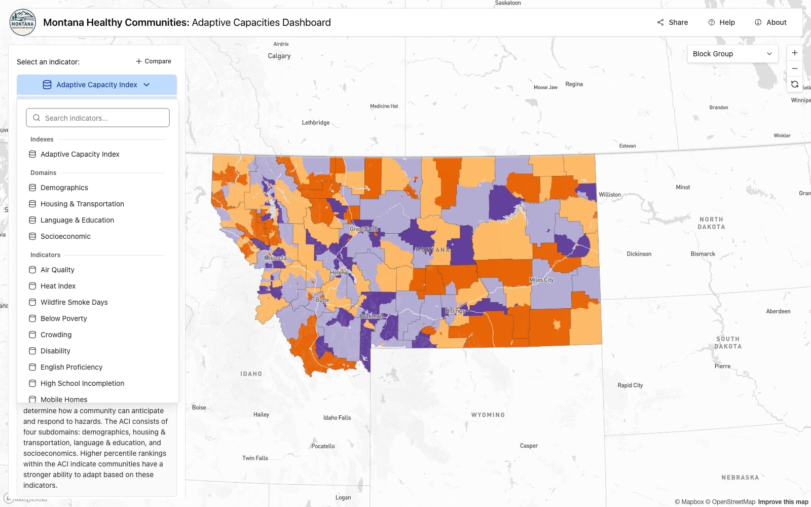
Image 1 of 4
The Montana Healthy Communities Dashboard is an open mapping platform built with researchers at the University of Montana's School of Public and Community Health. It brings health, environmental and socioeconomic data for Montana onto a single map.
Indicators are chosen from a searchable picker in three groups. Indexes holds the Adaptive Capacity Index. Domains holds its four components: demographics, housing and transportation, language and education, and socioeconomic. Indicators holds the individual measures, from air quality, heat index and wildfire smoke days through below poverty, crowding, disability, English proficiency, high school incompletion and mobile homes. Any of them can be viewed across five geographies, from block group up through census tract, county, place and school district, and stepped through by year.
The Adaptive Capacity Index sums the ranks of thirteen American Community Survey variables relative to every other Montana community, across four subdomains, each of which can also be mapped on its own. A higher percentile means a stronger ability to adapt. Its full definition sits on screen beneath the map controls, as does one for every other indicator.
Every map comes with a chart of the data behind it. For a single indicator that chart is the full ranked distribution, so alongside the map you can see whether Montana's communities sit bunched together on that measure or spread far apart, where the color breaks fall against that spread, and how steeply the curve climbs at either end. Under it a sentence in plain language says which color means what, with the color words set in their own colors, and a download button takes the data for whatever indicator, geography and year is on screen.
Compare puts any two indicators on the same map as a bivariate choropleth, with a scatterplot in place of that chart. Every community appears on it as a point, so how closely the two measures track each other, and which communities sit away from that pattern, can be read directly off it. The quadrants are shaded and labeled in plain language.
Every map the dashboard draws comes from a pre-rendered vector tile. A data-processing service imports the source data, computes the domain and index scores, and generates the tiles ahead of time, so nothing has to be calculated while someone is waiting. That is what keeps a dataset covering every block group in Montana, across more than twenty indicators and more than ten years, quick to draw at any zoom.
The platform is a Turborepo monorepo with three deployed applications: the public dashboard, an internal CMS where researchers maintain indicators, domains, indexes and help content, and the generator that runs the pipeline. Prisma manages the schema and the materialized views holding the domain and index scores, on Postgres with PostGIS. Shared packages carry the indicator and export services, the HTTP handlers used by both front ends, and the Mapbox map component including its bivariate compare mode, so the dashboard and the CMS draw maps the same way.