Global Commodities Prices Visualization
1,000 years of commodity prices

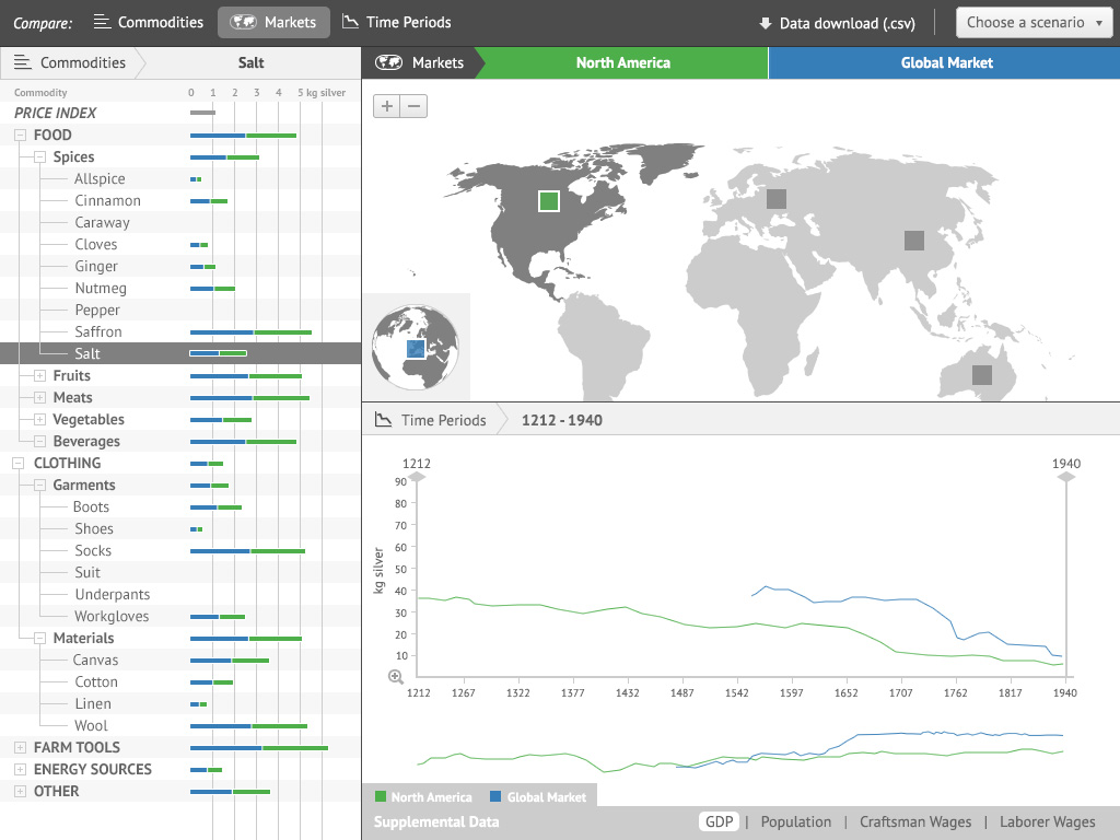
For Adam Matthew Digital's Global Commodities collection, we created this interactive visualization of commodity prices across the world through history. Users can compare prices of hundreds of different commodities in hundreds of markets and different time periods. Unlike other projects with Adam Matthew Digital, this visualization was designed for researches with the goal of hypothesis formation. The visualization presents data in 3 ways: A bar chart to compare across commodities, a proportional symbol map to compare across locations, and a line graph to compare across time. Each of these components functions as both a display and a control for building complex comparisons.
The visualization represents over 127,000 price values for 414 commodities across 245 markets over a span of about one thousand years. To help users navigate the data and to fill in gaps in the data, we aggregated both markets and commodities into a hierarchy (London can be viewed along with all of England, beer viewed alongside all drinks). The price data, along with some information about each market and commodity. We wrote a simple API to allow us to retrieve data for specific combinations of commodity, market, and time span which also handles the aggregation tasks on the server side. The data also integrates with the Global Commodities chronology so users can view how world events may have impacted the price of commodities.
We fashioned this as a classic geovisualization, with coordinated displays that each reflect selections made in the others. To make sense of the thousands of data points, we designed a system with three primary modes: comparison of commodities, comparison of markets, and comparison of time periods. In each mode several selections can be made, which then update the map and charts. A desaturated interface helps the brightly colored selections show up clearly. Each graphic component also provides context into each displayed value, showing what commodities, time periods, and locations make up a given value. We designed a tutorial system that guides users through the UI on its first launch. It provides contextual tips within the UI to instruct the user on how to use the system and data.
Most of this visualization was built around D3.js. D3's core data binding functions, along with its graphical capabilities, were ideal for these charts, which are constantly updated with new data values. Its support for geographic data furthermore was useful for the map component, allowing us to avoid yet another Mercator tiled map and instead use a more appropriately projected and simplified map for global and continental scales.


